
Intranet Design
Growmark eResource
Creating a resource portal for agricultural operations and communications
Growmark needed a re-design for their corporate extranet portal, eResource. This portal serves as the primary communication and resource hub between Growmark and it’s member companies. The main goal of this re-design was to improve the experience for users to accumulate and find data quickly, especially on mobile and tablet devices.
ROLE
UI Designer
CLIENT
Growmark, Inc.
AGENCY
PixelMill
YEAR
2016
BEFORE

AFTER

PHASE ONE
Research & Discovery
Defining the problem
The current eResource portal contained lots of information that was difficult to find. The level of navigation needed to be simplified in order to find information more efficiently. In addition, the design of the portal was outdated and non-responsive. Growmark was moving towards the mobile-ready work environment, but eResource was not compatible with their everyday devices. Since a majority of the users on eResource were member companies working off-site, the re-design needed to be updated to be mobile-first in order for users to access information quickly.
Current state analysis
We started this project with a thorough site analysis of their current portal. We identified commonly visited pages. We then conducted interviews with primary eResource staff including leadership, key group members, and existing web authors. Through these interviews, we found common pain points and areas of improvement.
Through our findings, we came up with recommended features and functionalities that would help solve their problems. Our recommendations was to build a responsive design system through a mobile-first approach, a hierarchical navigation, robust search, and bookmarking.
PHASE TWO
Information Architecture
Re-thinking the content structure
A common pain point of the current portal was that there was a vast amount of information that was difficult to find. There was no hierarchy in the navigation structure and the levels of navigation was about 7-8 levels deep. It was certain that the new portal needed to be re-designed in a way so that the navigation is simplified and organized more efficiently.

PHASE THREE
Visual Design
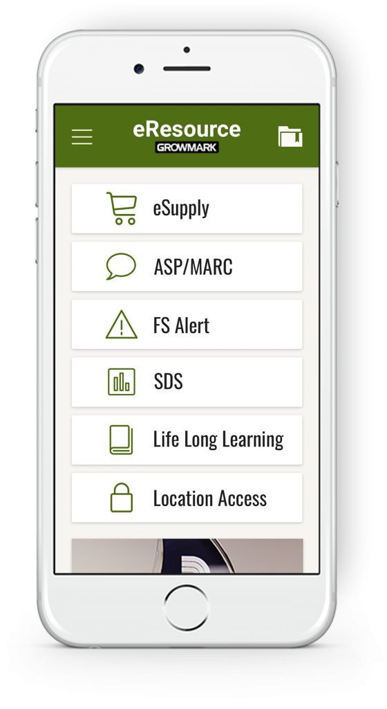
Mobile-First Approach
Since the most common pain point was the inability to access the portal on mobile, we decided to take a mobile-first approach in order to create a seamless experience on mobile devices. I took the findings from discovery to determine which features and components were most important to the users and structured them in order of importance in the mobile layouts.


Desktop Experience
The client was very open to design ideas but wanted to maintain the current eResource color palette. They also didn’t want eResource to match their public site in order to have a clear differentiation between their sites. We started with a mood board that would capture the overall look and feel of the visual design. Once we agreed on style elements, the visual design aspects was applied.


