SaaS B2B Dashboard
Conquer Workspace
Empowering Sales and Service Leaders to manage their team efficiently
Conquer is a sales enablement platform in the SaaS ecosystem that helps sales and service teams exceed pipeline, revenue, and retention goals by boosting productivity and increasing engagement. Conquer needed a re-design for their B2B Admin Dashboard which was used for managing and administering sales and service processes for enterprise business.
ROLE
Lead UI/UX Designer
CLIENT
Conquer
YEAR
2020–2021
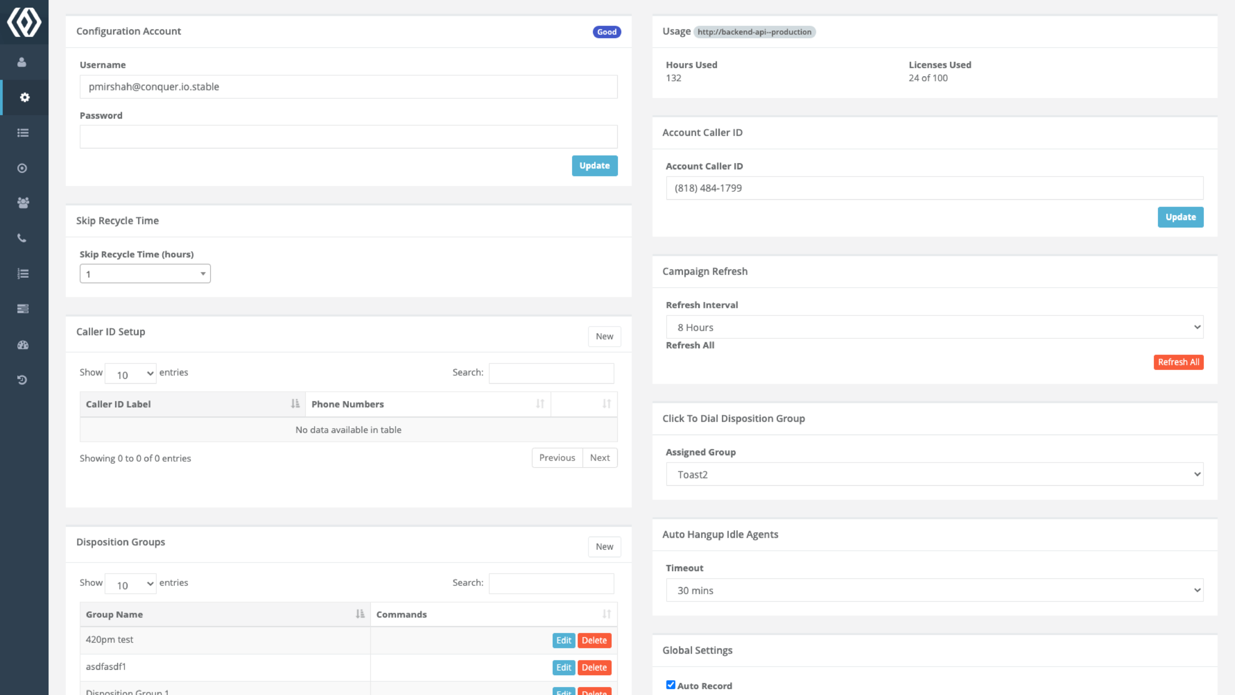
BEFORE
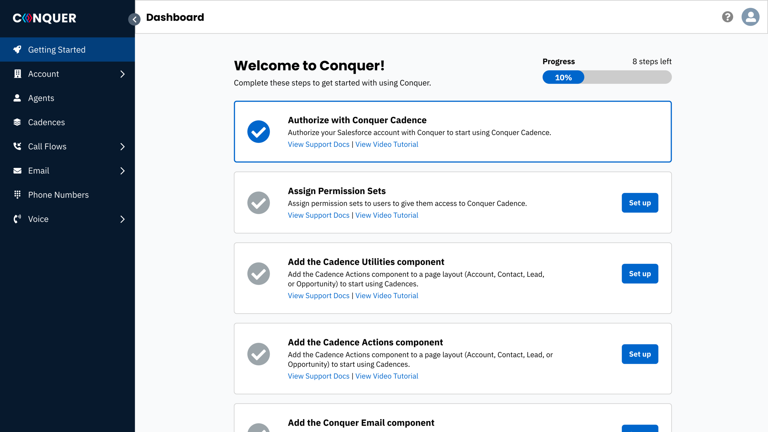
AFTER

Fun Fact: I worked at Conquer as a sole designer.
I joined Conquer (formally named DialSource) in 2019 as the first and only designer at the company from 2019–2022. I worked in a team of 10 developers and 1 QA engineer.
During my time at Conquer, I learned many valuable aspects to being a lead team member for a product team such as:
Implemented a product design process
Established a product documentation process
Improved usability throughout the product
Established a design system
PHASE ONE
Discovery
Identifying the problems
The discovery process consisted of user research, usability testing, and feature usage validation. Some questions that came up during the discovery process included:
What parts of the product are being used and/or not used?
How many clicks does it take to accomplish XYZ?
Are users able to find what they are looking for without any assistance?
To answer these questions, I conducted user interviews and usability tests with a selected number of current customers who were interested in offering their feedback. The user interviews included questions around how they currently use the product, what they find usable, and what they would improve.
Usability Testing
For the usability tests, users were given specific tasks to accomplish within the product. They were conducted via Zoom call and the users would proceed with the task in the best way that they could. I analyzed the user’s behaviors while they completed their assigned tasks. This provided valuable insight for discovering areas of the product that have room for improvement.
-
Usability Task #1:
Navigate to where you would add a new campaign to start a new campaign for agents to call on. -
Usability Task #2:
Add an optional field to an existing disposition, using the Account object. -
Usability Task #3:
Edit an existing cadence with an additional email step. -
Usability Task #4:
Navigate to where you would add a new agent to a call queue.
Examples of usability tasks conducted with existing customers using our product.
Based on my initial discovery with current users of the product, these were the main problems that were found:
No sense of organization
Users had trouble finding things throughout the product because there is no sense of organization.Too many clicks when setting up configurations
Dashboard is split in 3 different tabs, confusing to know where to find thingsDifficult terminology
Previously, the company was very engineering led, which resulted in engineers designing the product in the best way they know how. This resulted in having a product that contained terminology that was not very user friendly, which caused users to not fully understand the capabilities of the product.
PHASE TWO
Defining Requirements
Product Requirements and User Stories
The research and feedback that was gathered from discovery was utilized into formulating the product requirements for this project. As the lead designer of the team, I was responsible for outlining the product requirements into a formal Product Requirements Document (PRD). I proposed a list of product requirements and user stories that would be feasible for developing a Minimal Viable Product (MVP). This document was used to communicate with stakeholders and team members for project planning and execution.
Main Goals
Create a consolidated experience
Move access to tab into 1 dashboardPermission based access
Give access to users to specific areas based on permissionsImprove UX language
Making terms easier for users and adding more helper textEstablish a design system
Over the years, the engineering team did not have a consistent code base and no established design system. This resulted in using extremely different styling throughout the product.
-
As a [type of user], I want to [perform some task] so that I can [achieve some goal].
The template structure used for outlining user stories.

List of features and user stories from the Product Requirements Document (PRD).
PHASE THREE
User Experience
Information Architecture
Since creating a consolidated experience was one of the main goals for this project, it was important to re-define the information architecture of the application so that the navigation is more clear and concise for users. The major issue that users had with the navigation was that menu items lived in 3 different areas, and it was difficult to remember where items were when you were looking for them.
To strategize a new navigation system, I conducted card sorting and tree testing exercises to study how users would organize items in the application.

User Flows
Since creating a consolidated experience was one of the main goals for this project, it was important to re-define the information architecture of the application so that the navigation is more clear and concise for users. The major issue that users had with the navigation was that menu items lived in 3 different areas, and it was difficult to remember where items were when you were looking for them.
To strategize a new navigation system, I conducted card sorting and tree testing exercises to study how users would organize items in the application.
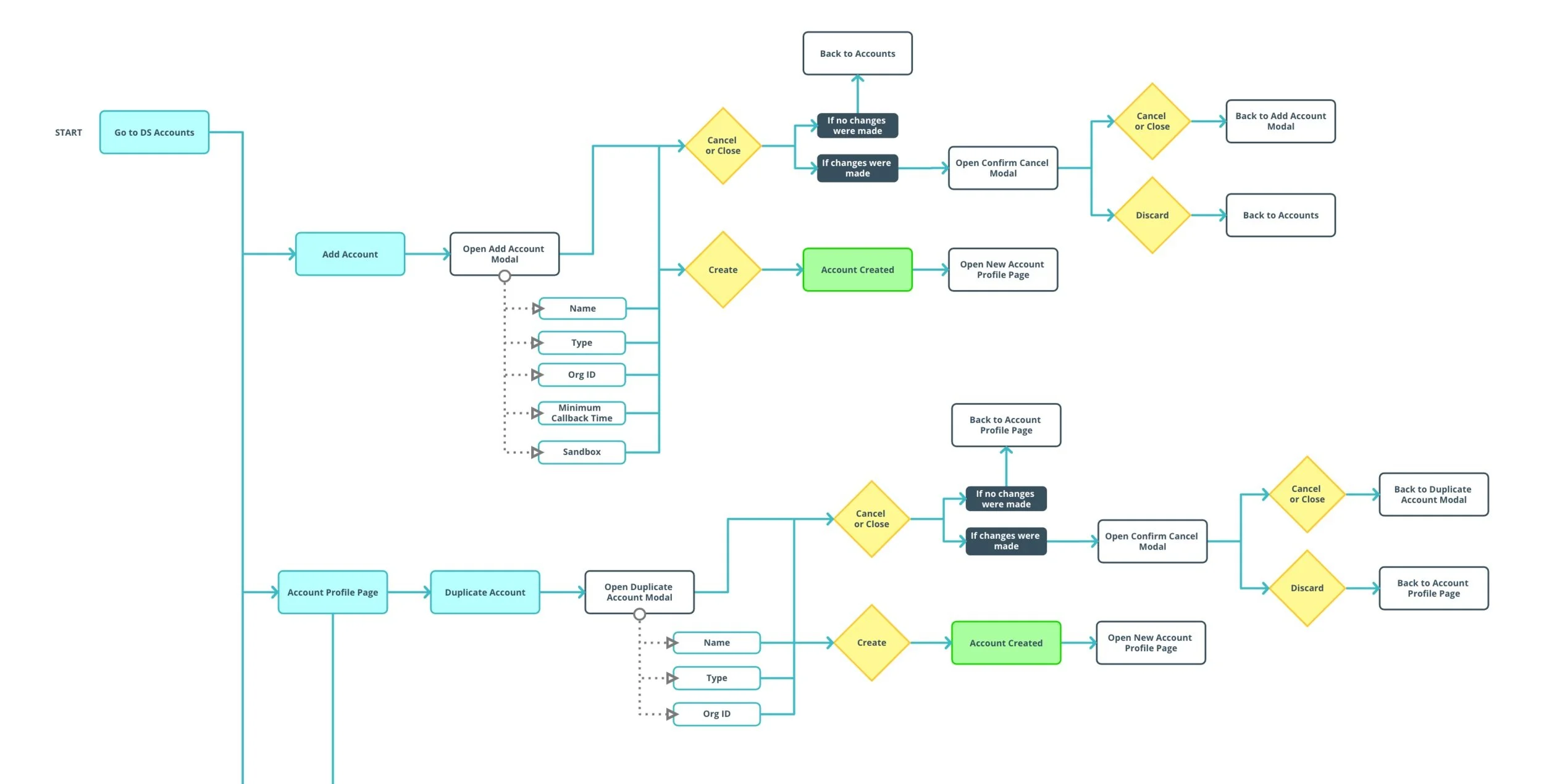
Example of a user flow diagram.
PHASE THREE
Initial Wireframes
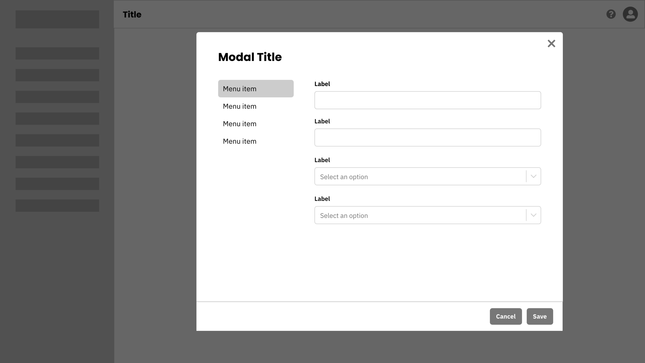
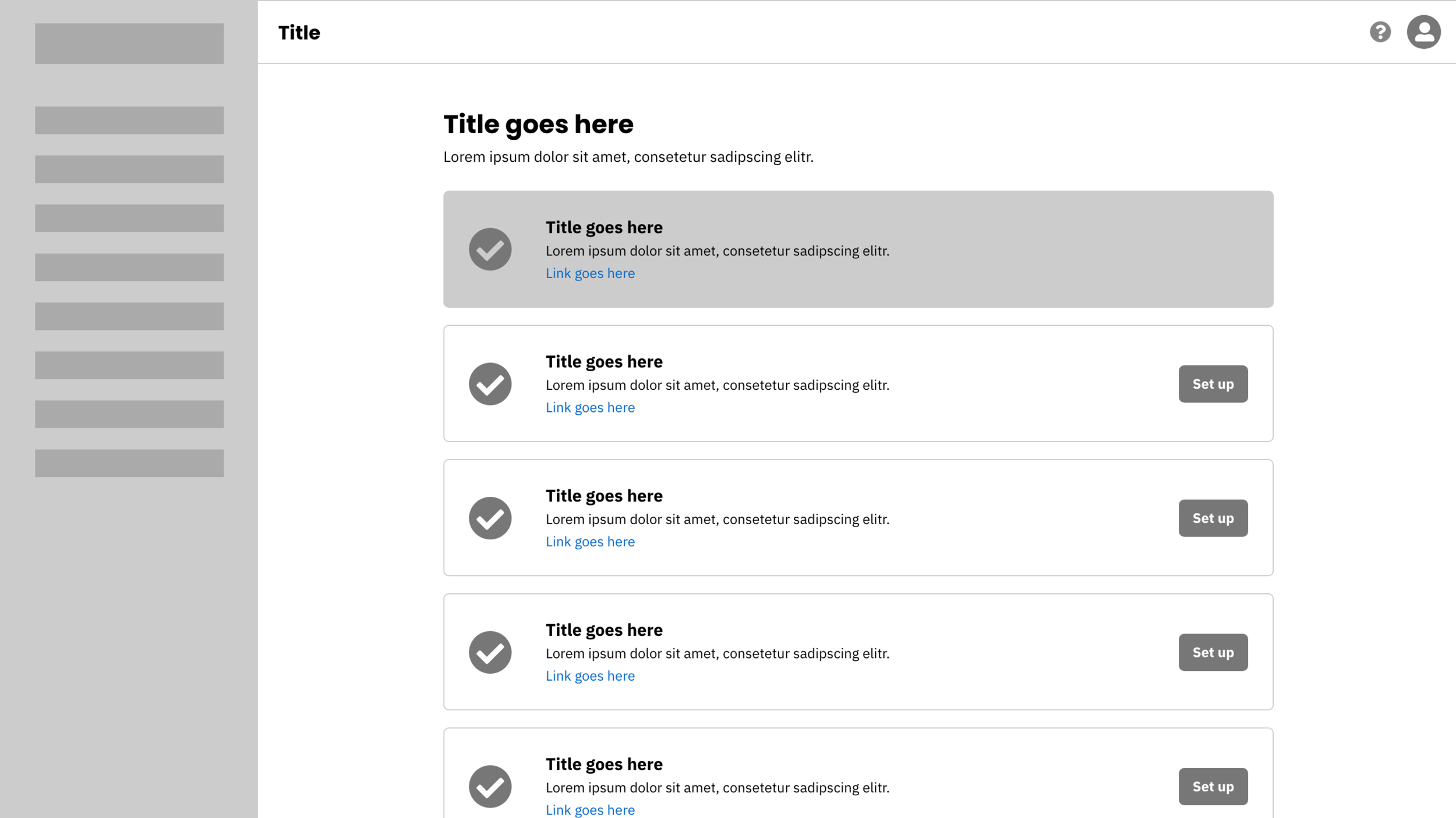
Based on the initial requirements that we identified in the Product Requirements Document, I produced basic wireframes to ideate potential solutions for the identified problems. These wireframes were used as initial ideas to gather feedback from users, engineering, and other stakeholders.
To further illustrate the functionality being demonstrated in the wireframes, I documented a list of user stories for each feature within the product. This gave the development team a better idea on building this product with the perspective of the user.

PHASE THREE
Visual Design
Developing a Design System
As we were in the process of developing the new dashboard, the company was also going through an entire re-brand. I worked closely with the branding designer to implement a product design system that aligned with the company’s new brand standards and guidelines.
Once we had a good design system in place, it was easy to choose which components were needed for each page while having the wireframes and user stories for reference. I designed and prototyped each page using Adobe XD, which was then presented to stakeholders, developers, and potential users.
Some notable UI improvements include:
Multi-level navigation
Nested tables
One page forms
Helpful tooltips

Designing the overall product
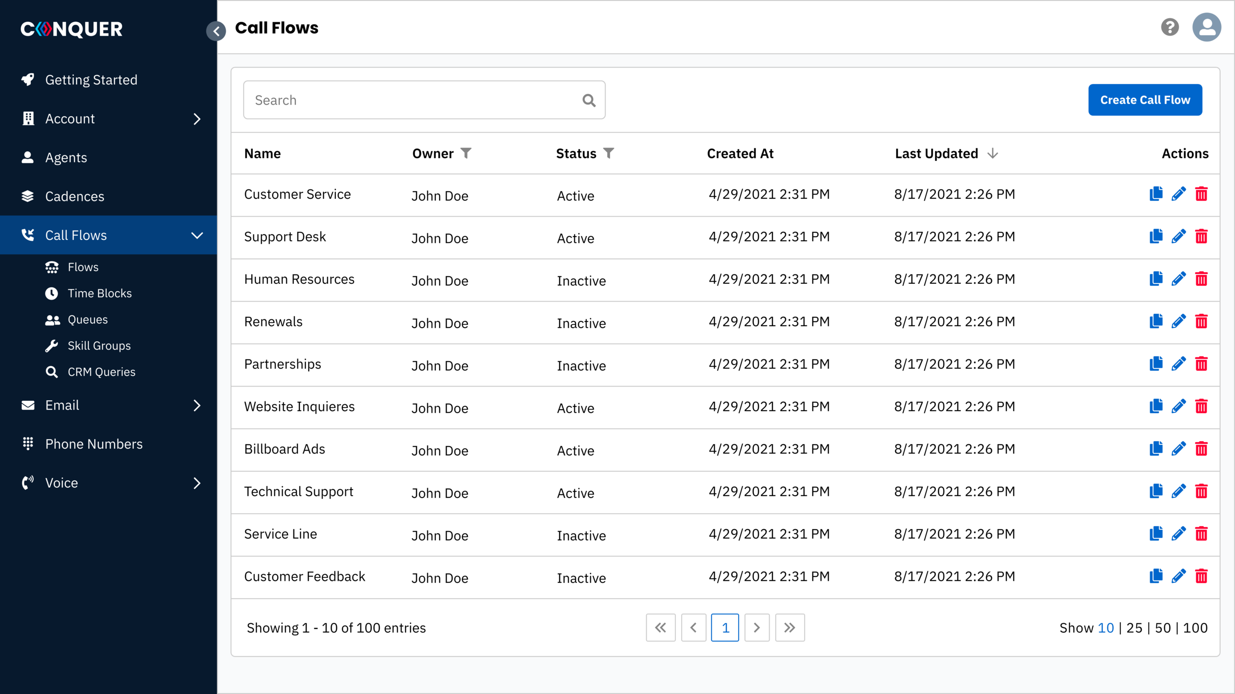
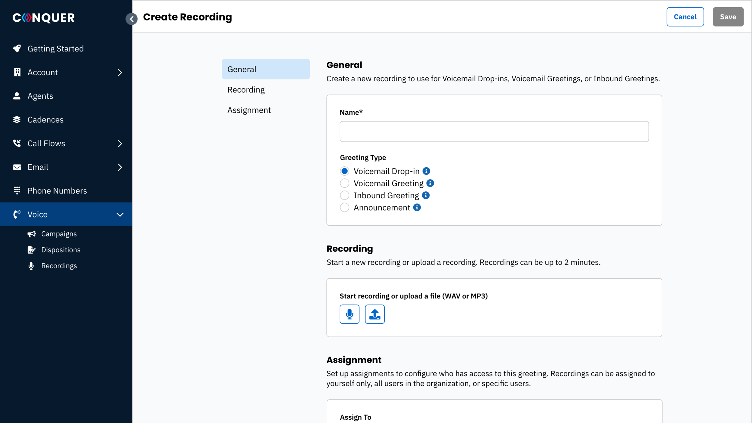
The overall product design was a collaborative effort between developers, customer success, support, and customers. It took various iterations to get to a point where it worked all around functionally and effectively. I created designs for common pages that we would have throughout the product. The final designs were intended to be flexible and interchangeable so that we can continue to expand the product and add new features as necessary for the future.


Outcome
Overall, customers were very satisfied with the updated dashboard. Usability of the product has increased tremendously. The outcome of this has shown by the amount of support tickets that are reported by customers.
Since this was only released as an MVP, there are many improvements to still be made. The team is continuing to improve the product by constantly testing and gathering feedback from customers.